Healow Healthcare App Redesign
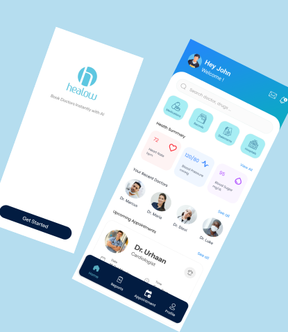
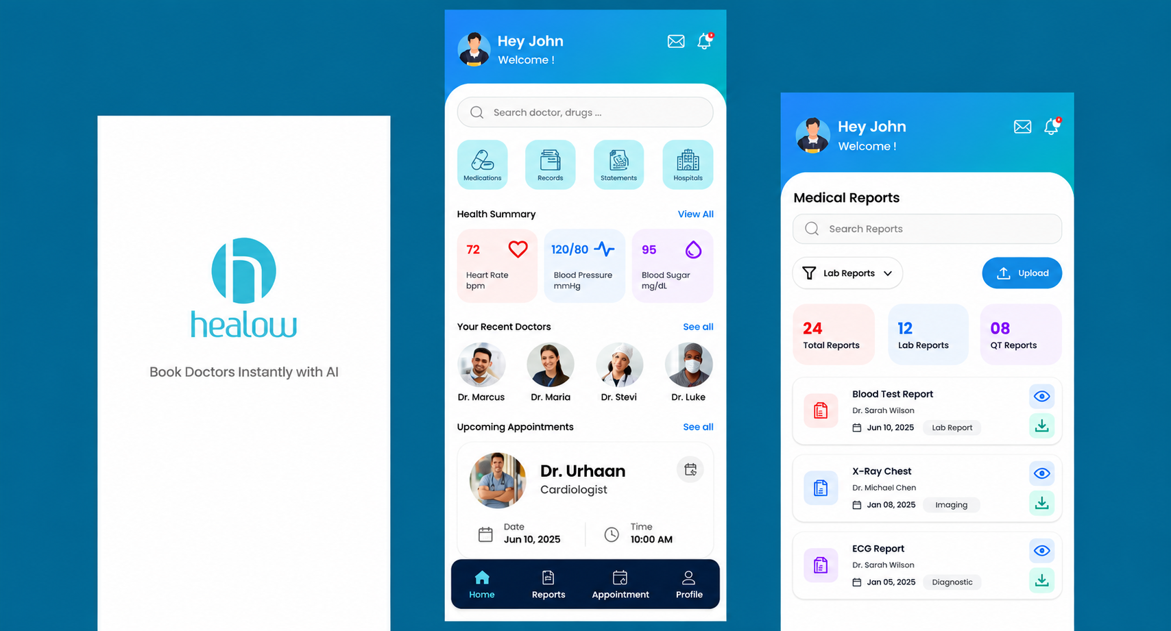
The goal of this project was to redesign the Healow mobile healthcare experience to make common healthcare
tasks simpler, clearer, and more accessible.
The redesign focuses on reducing friction across key user journeys such as signing in, finding doctors,
booking and managing appointments, making payments, adding family members, and accessing medical reports.
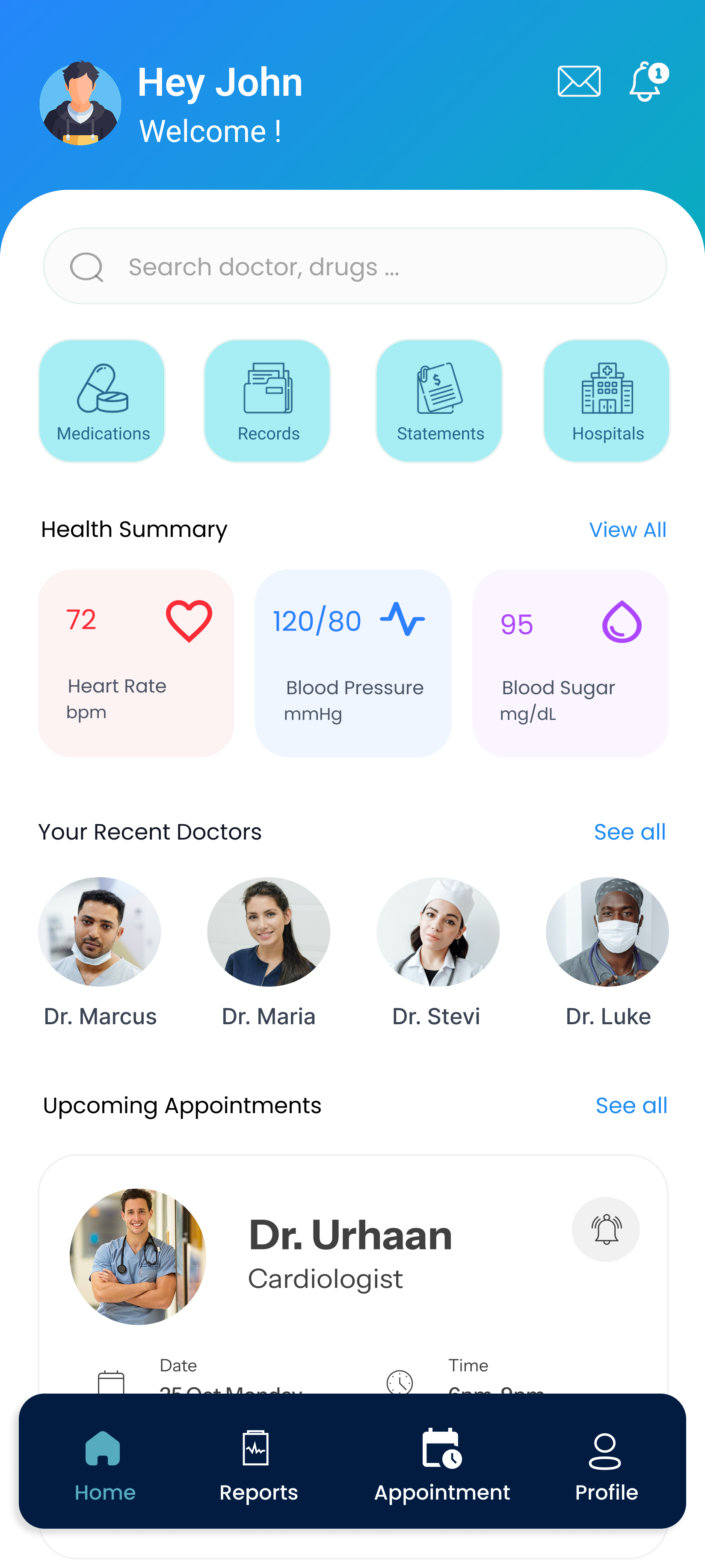
Along with improving the visual interface, the project focused on creating clearer information hierarchy,
reducing unnecessary steps, providing meaningful system feedback, and making important healthcare information
easier to find.
Key Focus Area
-
Simplified Appointment Booking
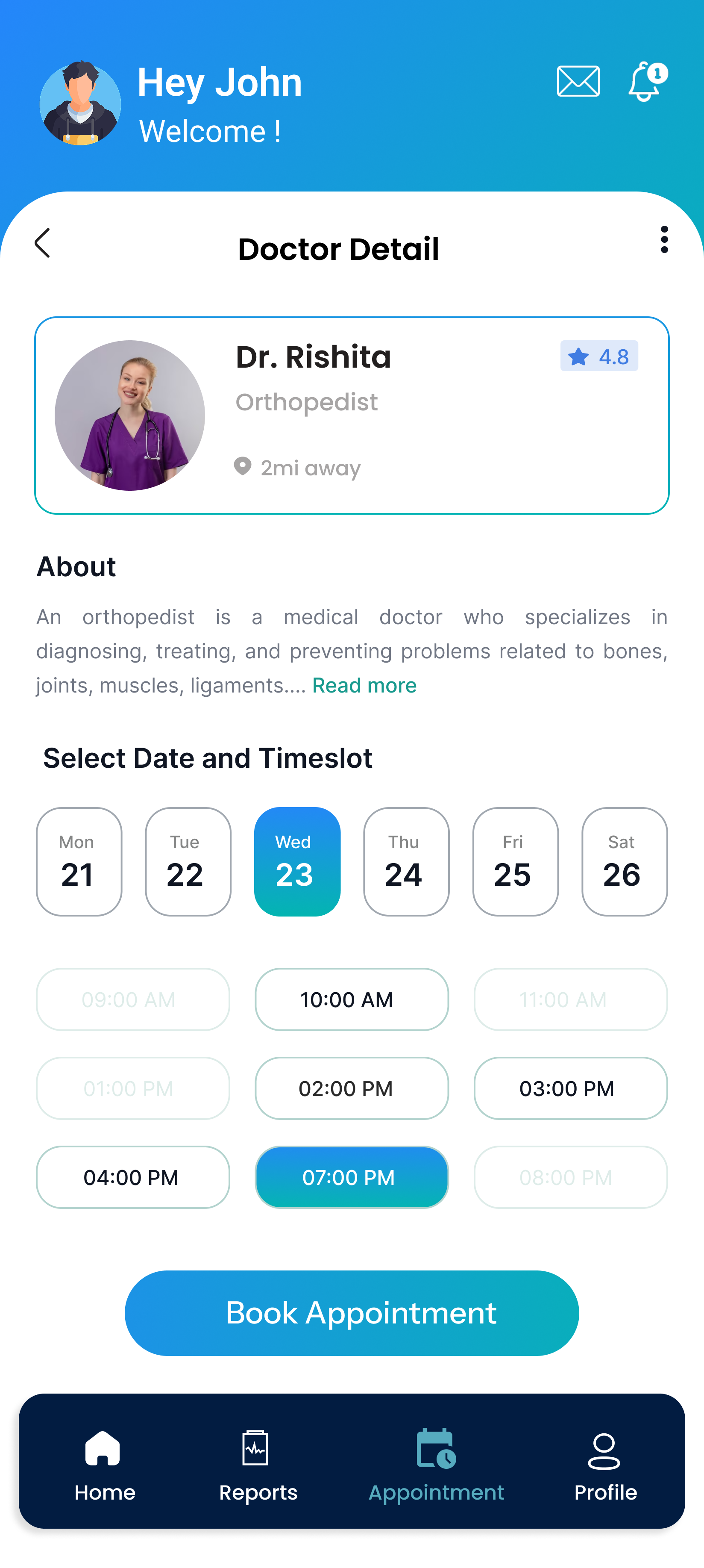
Redesigned the booking journey to help users quickly discover doctors, review profiles, select available time slots, and confirm appointments.
-
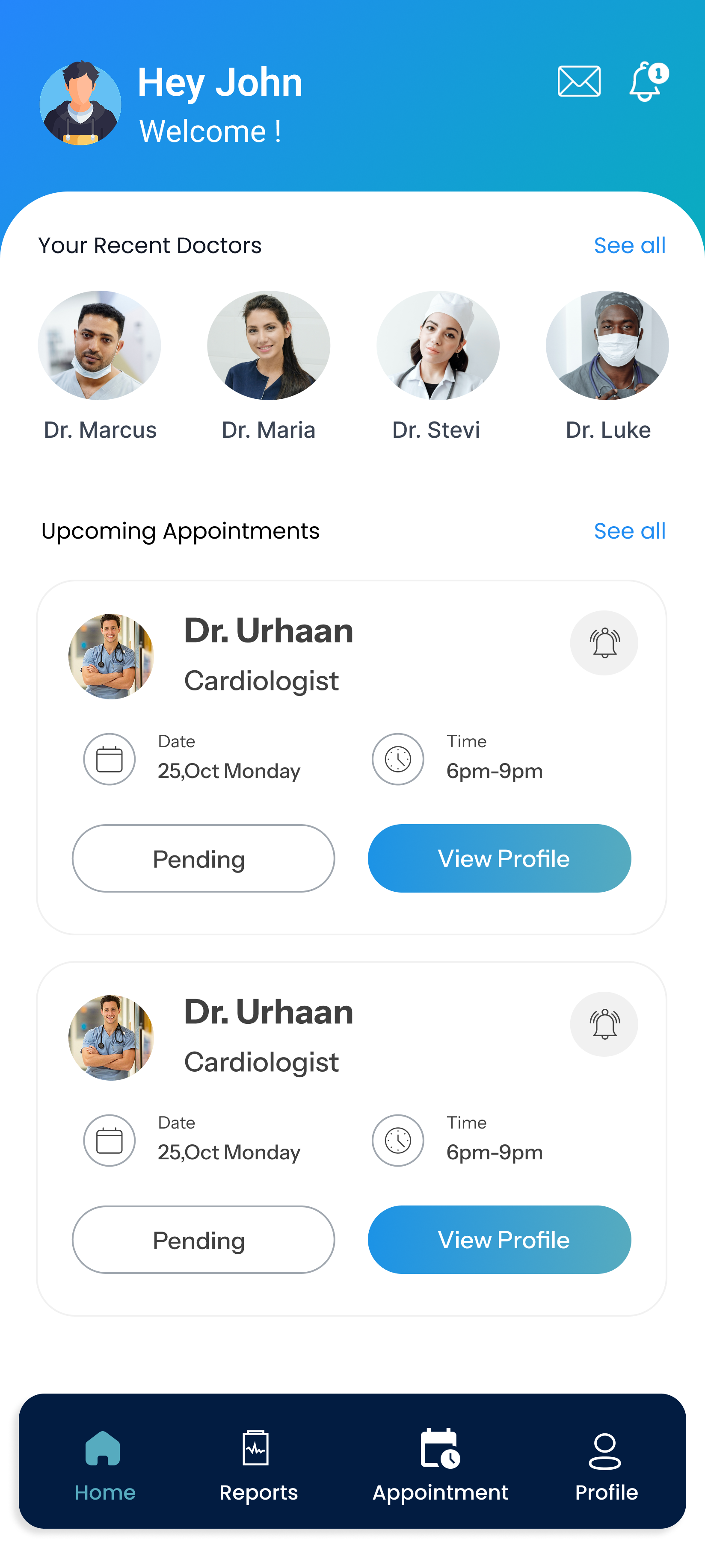
Improved Appointment & Family Management
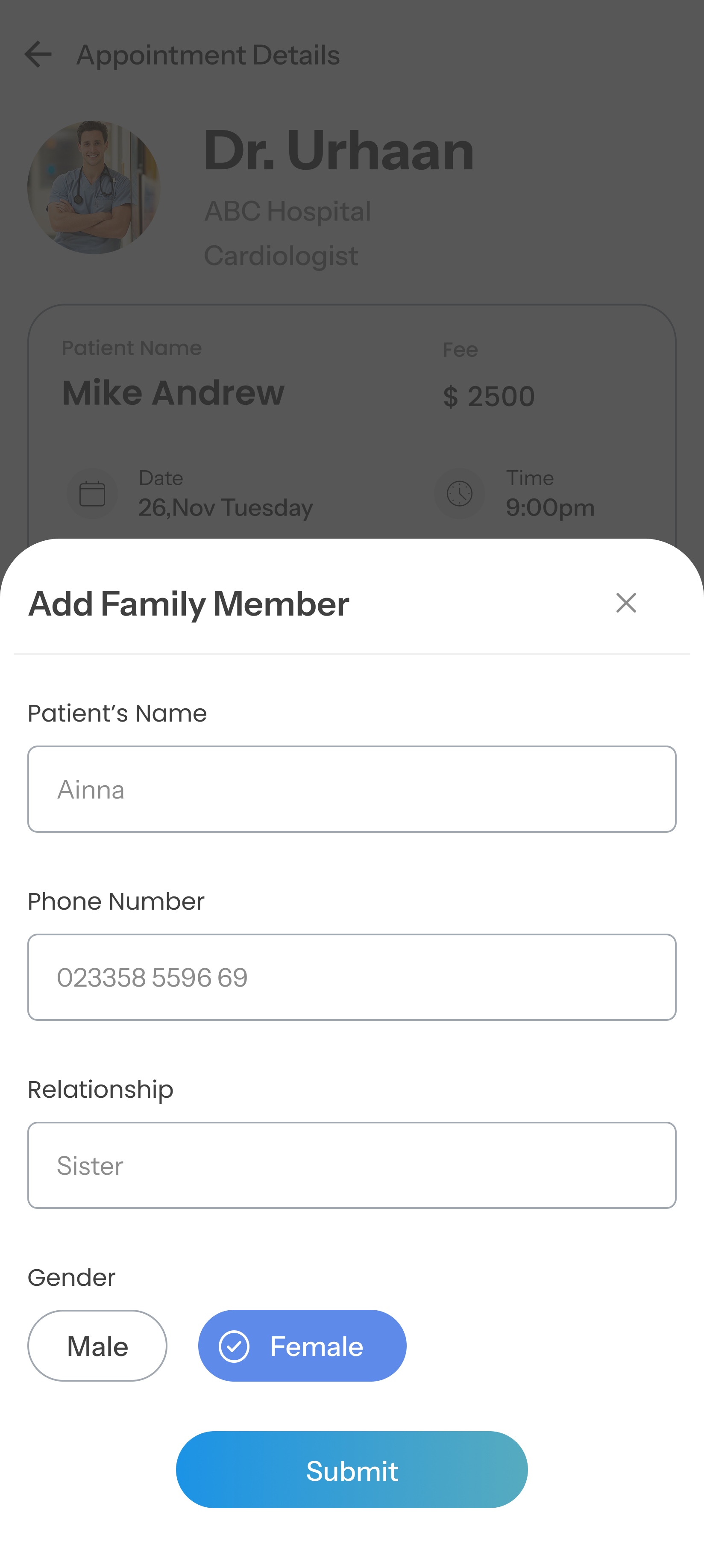
Created a centralized appointment experience where users can review details, reschedule visits, manage insurance information, and add family members.
-
Streamlined Payments
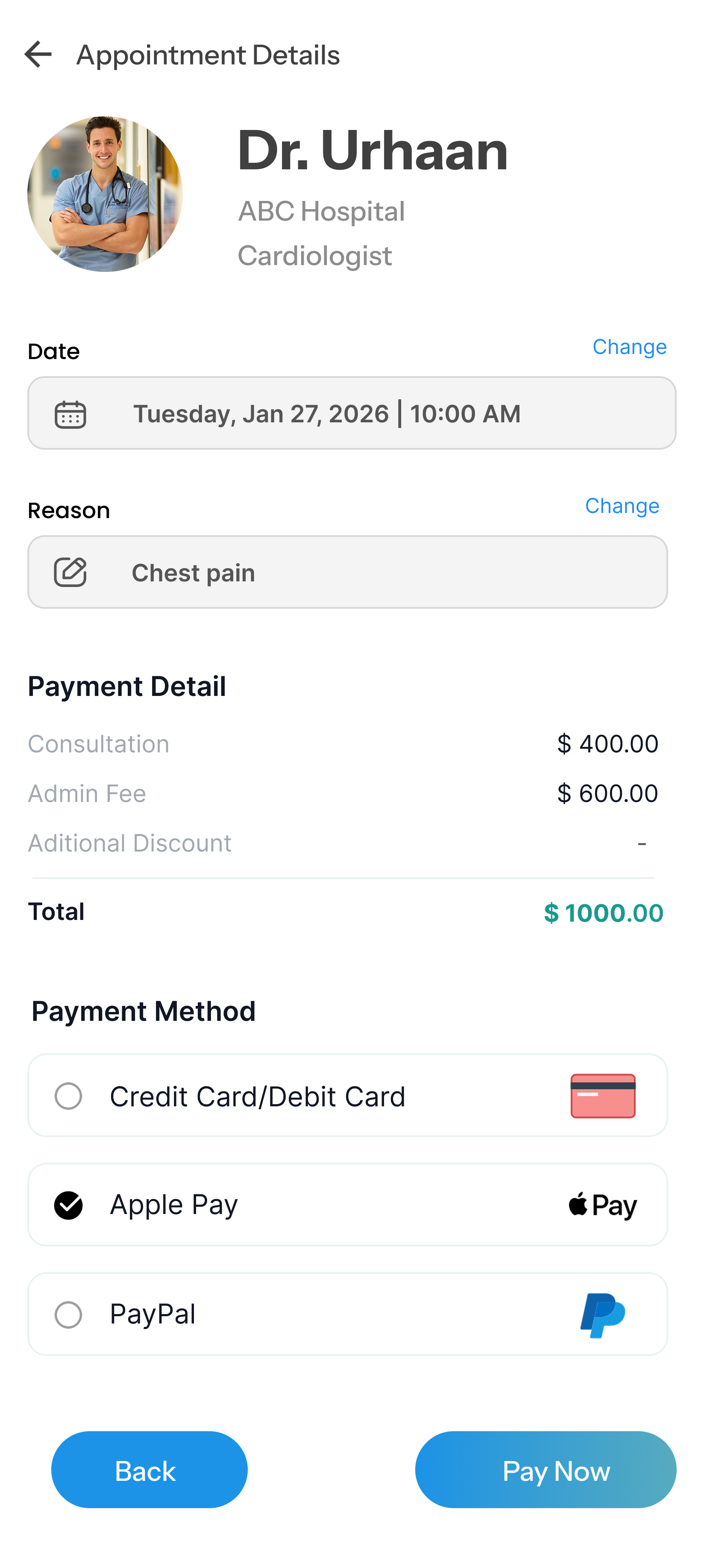
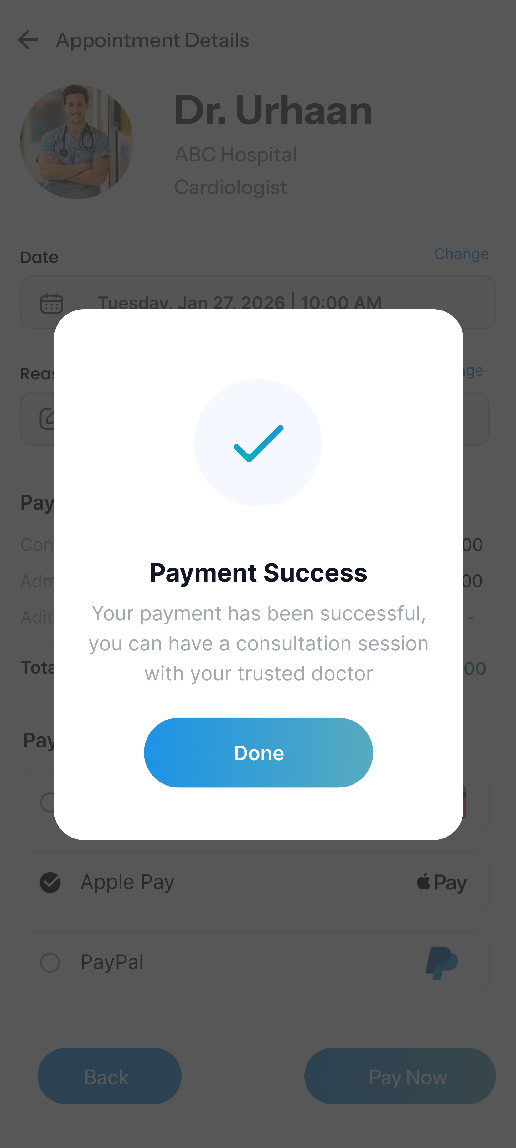
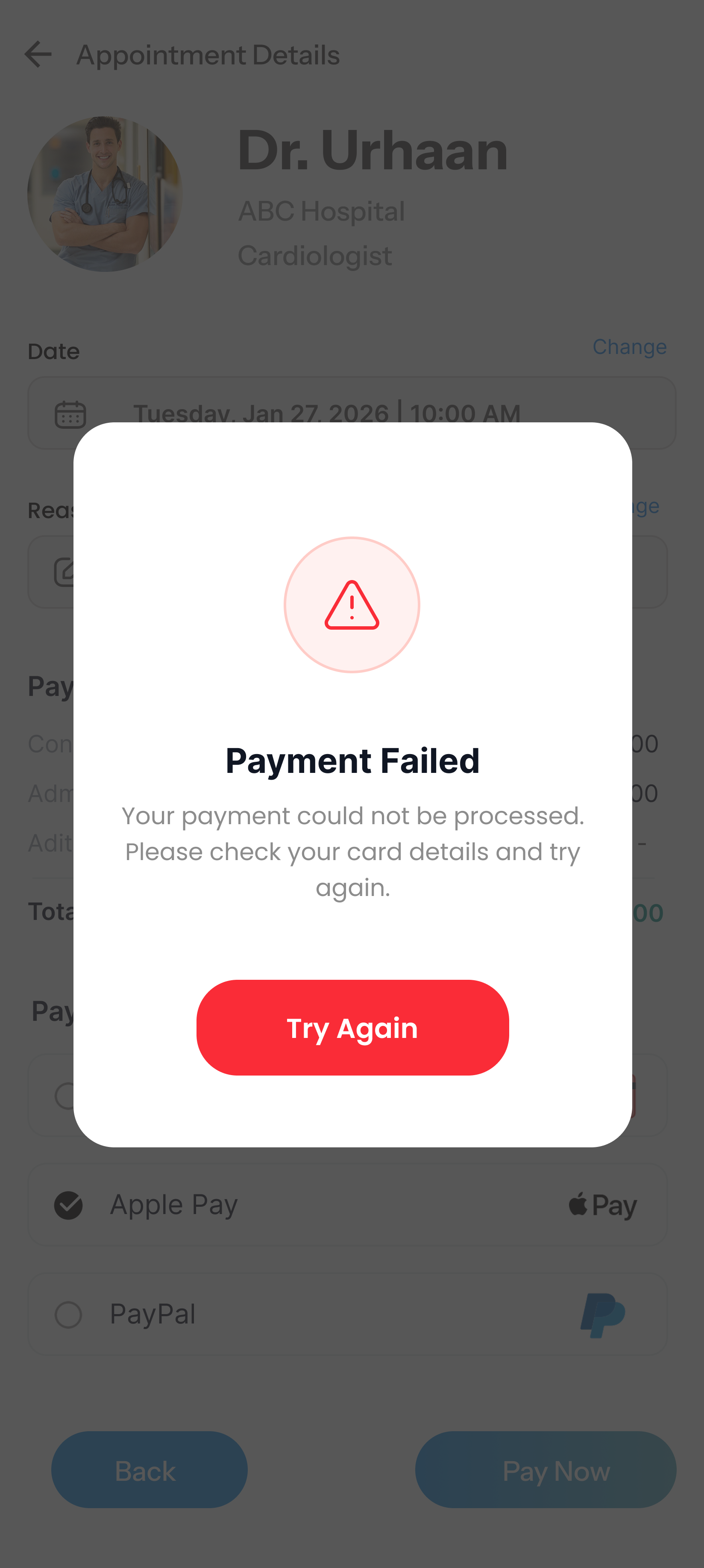
Simplified the payment flow with clear cost information, payment options, and immediate success or failure feedback.
-
Better Medical Report Management
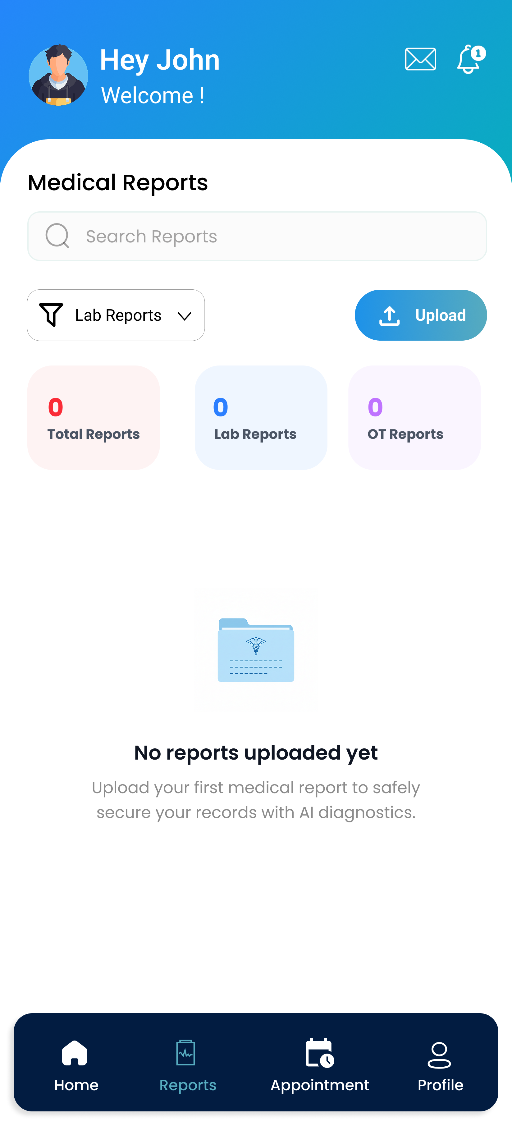
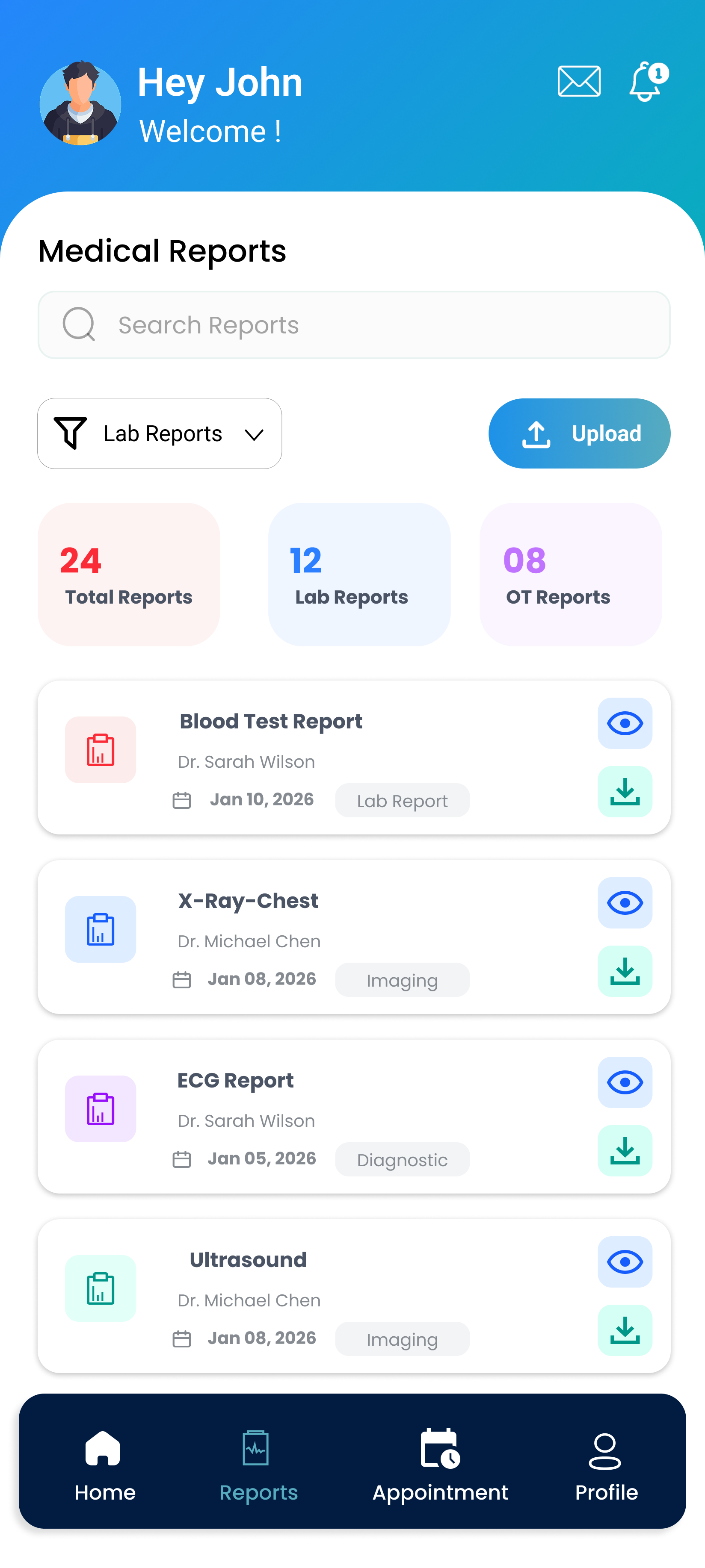
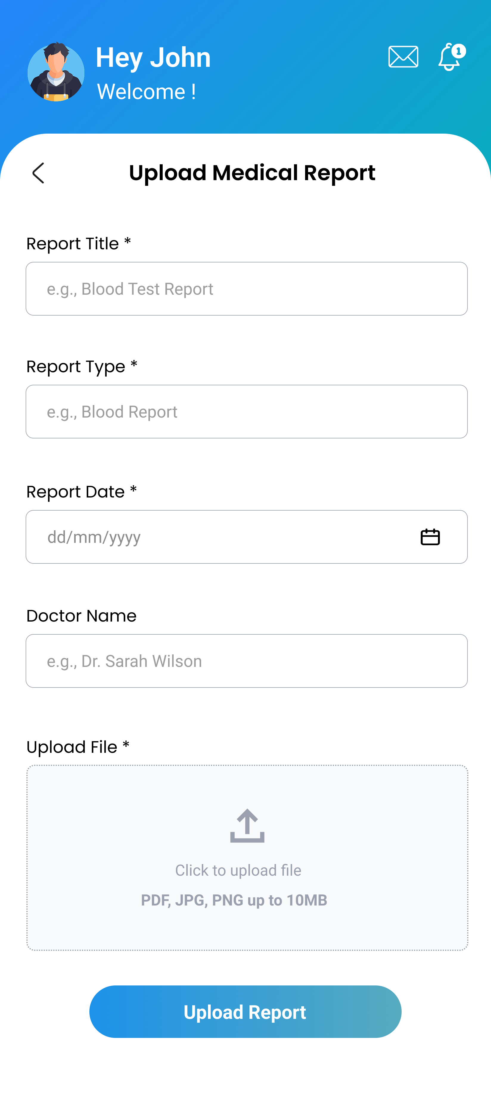
Organized medical records into a searchable report hub with filtering, report categories, and an easy upload experience.
Prototype & Iteration
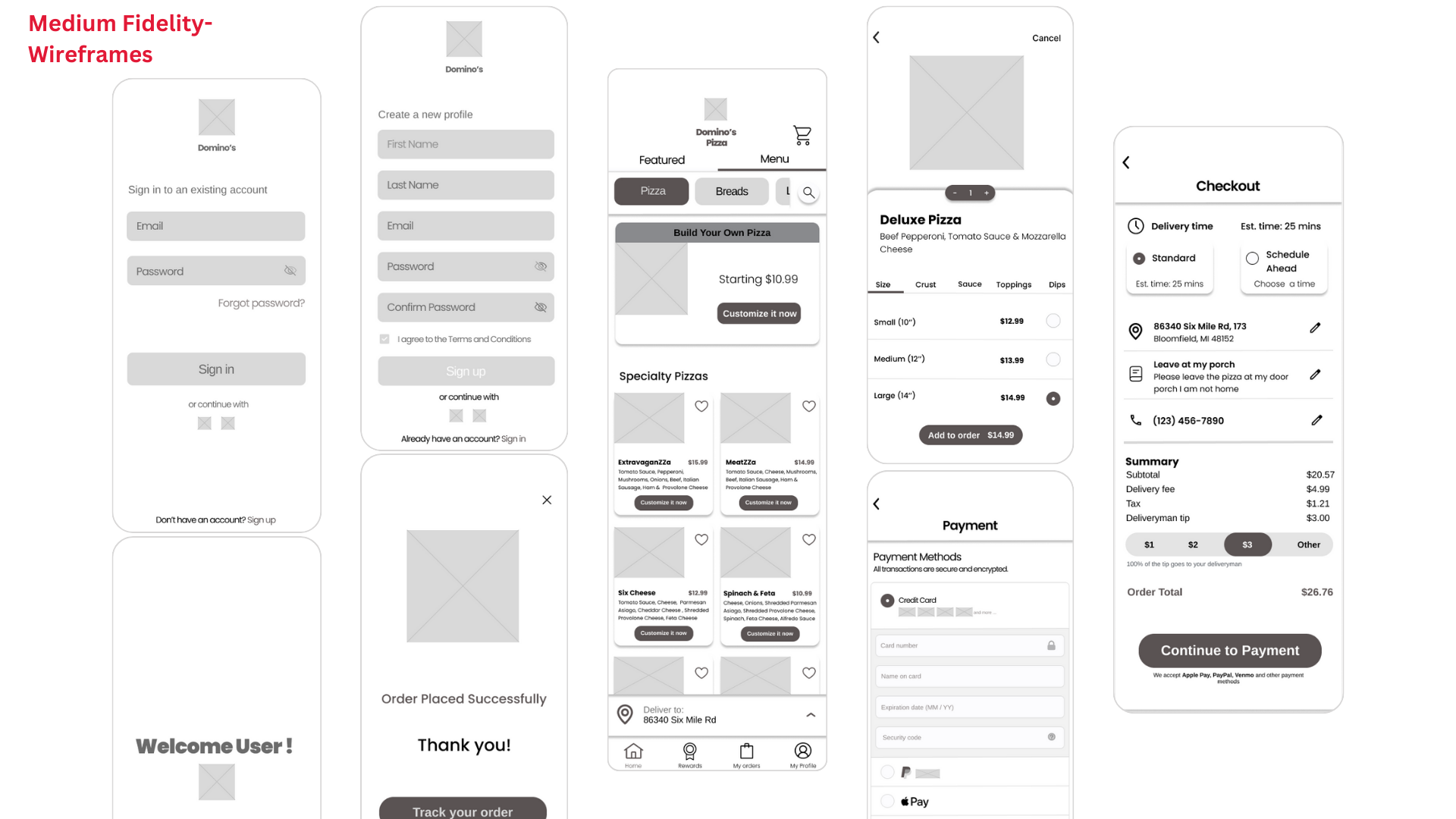
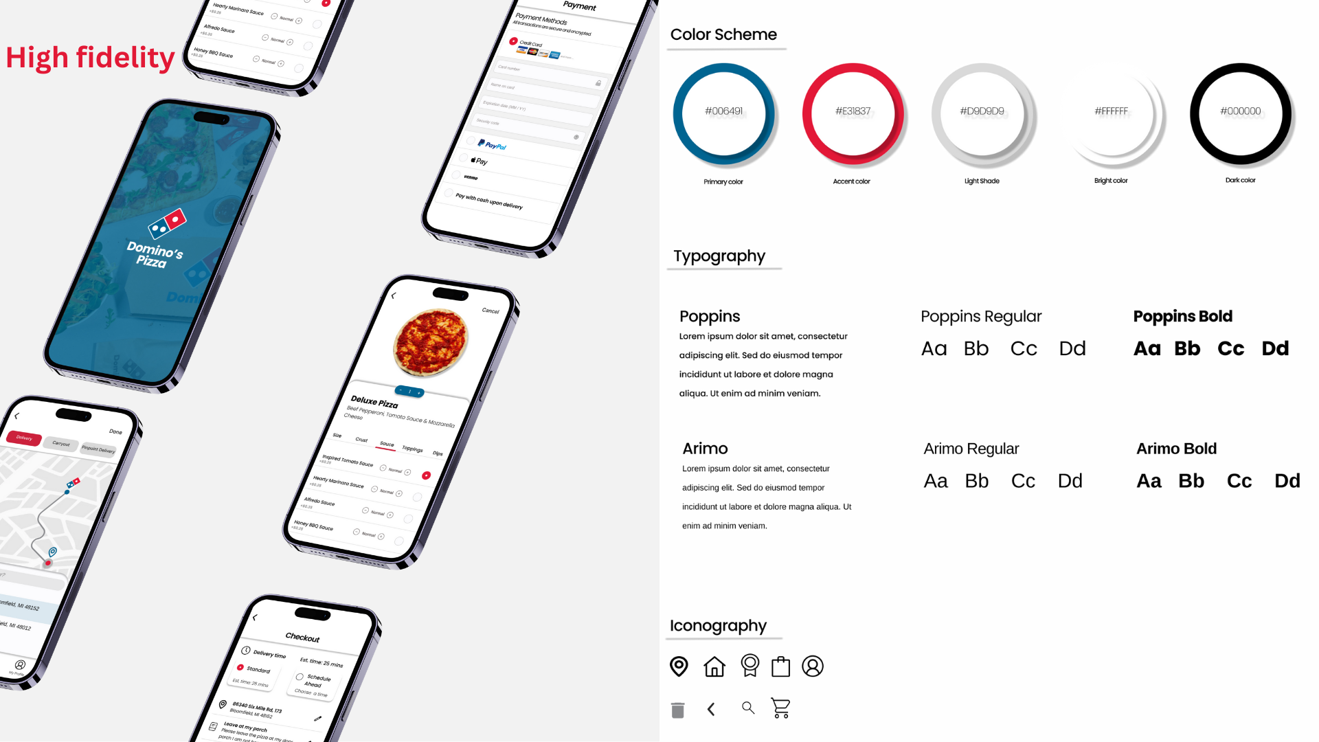
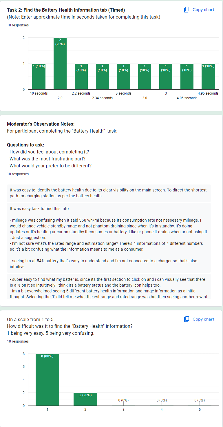
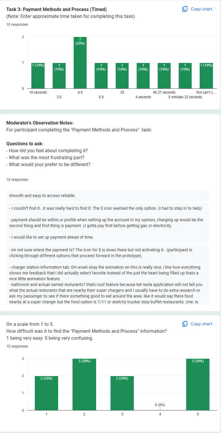
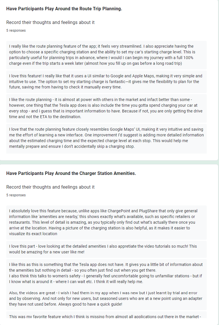
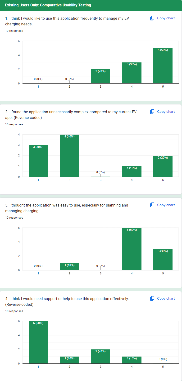
I created the redesigned screens in Figma and connected the primary user journeys into an interactive prototype.
The design system maintains consistency across:
- Typography
- Cards
- Form fields
- Buttons
- Navigation
- Icons
- Modal dialogs
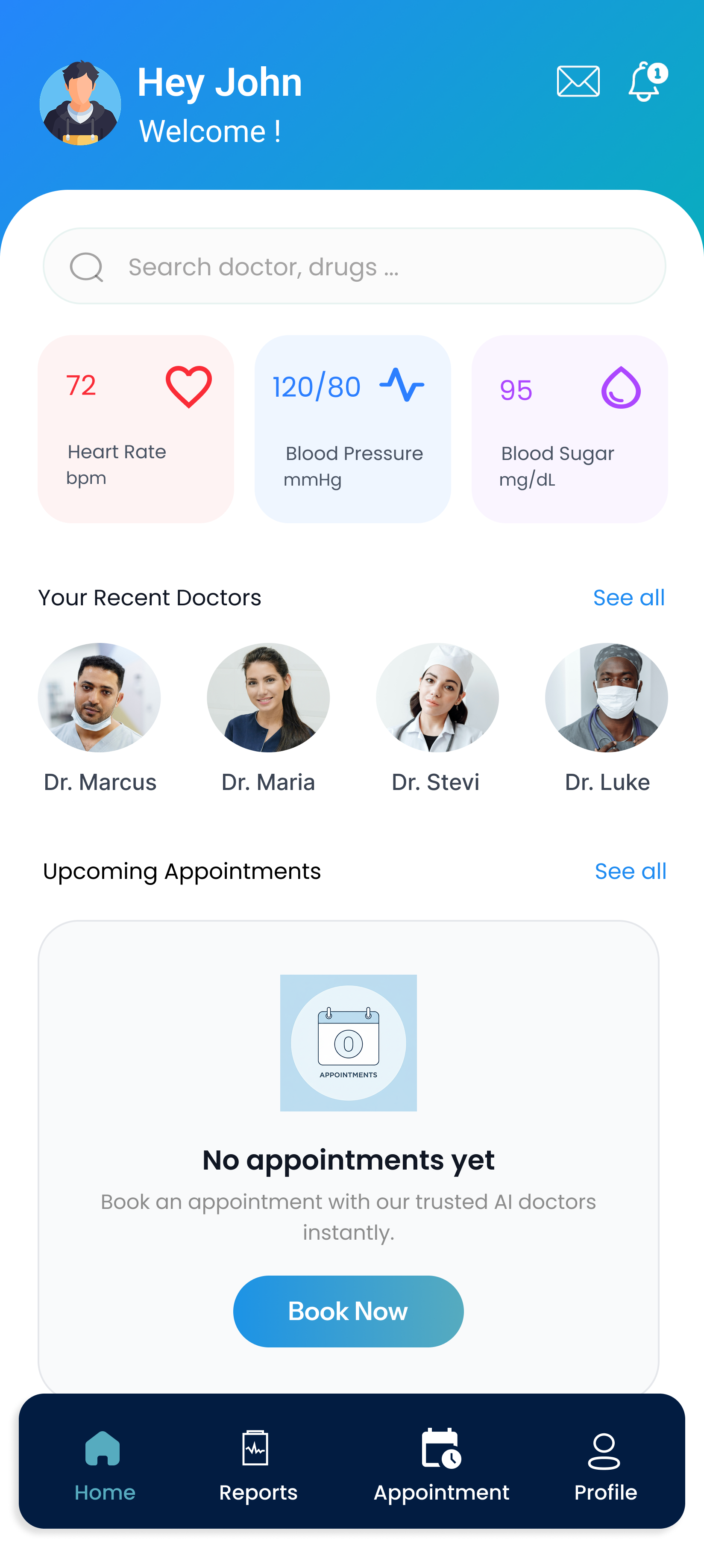
- Empty states
- Success/error feedback
Components were designed to be reusable so that new healthcare workflows can be added while maintaining visual consistency.
Key Improvements
The redesigned Healow experience focuses on five major improvements:
-
Simplified navigation
Core healthcare functions are accessible through predictable navigation.
-
Reduced booking friction
Doctor discovery, scheduling, patient selection, and appointment management form a connected workflow.
-
Better information hierarchy
Important appointment and health information is surfaced before secondary details.
-
Clear system feedback
Success, failure, error, and empty states communicate what happened and what users should do next.
-
Improved healthcare record access
Users can search, organize, view, and upload medical reports from one dedicated area.
From Design to Development
To take the project beyond a visual redesign, I also translated the interface into a working front-end implementation using React / Next.js.
Reusable components were created for common UI elements such as the header, bottom navigation, appointment cards, doctor cards, report cards, forms, and modal states.
Mock data was used to populate appointment and doctor information while maintaining reusable component architecture.
This helped validate whether the proposed design could translate effectively from Figma prototypes into an actual responsive interface.